When describing the characteristics of great visual design, graphic designers will often refer to the principles of design. If the elements of design are the what of design - er, what we use to create designs - then the principles of design should be considered the how, meaning how we compose the elements into an effective design.
It's important to remember that design isn't a science. It's as simple as moving elements around until it feels right, which sometimes can be pretty difficult. However, the more you design as well as study it, the better you'll be able to use these principles to inform your designs.
It's important to remember that design isn't a science. It's as simple as moving elements around until it feels right, which sometimes can be pretty difficult. However, the more you design as well as study it, the better you'll be able to use these principles to inform your designs.
UNITY
Obviously, you want your design to viewed as one coherent whole. This is accomplished through unity. Unity is achieved through Proximity, Alignment, Repetition, and Rhythm.
BALANCE
|
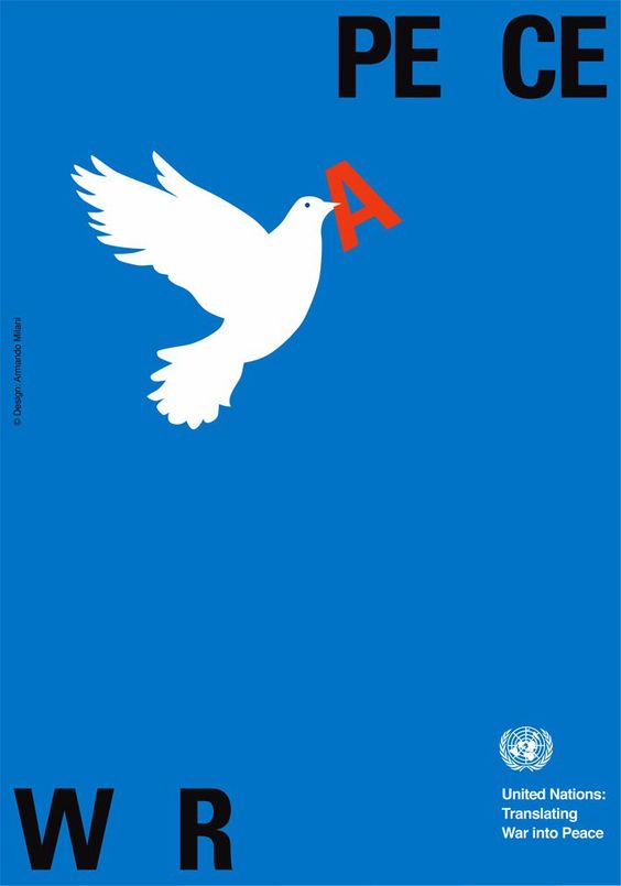
There are essentially two types of balance - symmetrical and asymmetrical. Symmetrical balance suggests that the elements used on one side (left or top) of the design are similar to those on the other (right or bottom). Asymmetrical balance consists of the sides being different but still look balanced. The key is that the distribution of design elements provide a balanced "visual weight" that make the design feel stable.
|
|


CONTRAST
|
Contrast refers to differences in design elements, such as color, value (light and dark), direction, shape, size, etc. When two opposing elements are placed side-by-side, there is a feeling of excitement. Contrast helps to emphasize important elements within the design.
|
|


PROXIMITY
|
When elements are placed close together in a group they will be viewed as a group, thus creating a natural relationship between each element. When elements are placed far apart, they become unrelated and are viewed as separate ideas.
|
|
ALIGNMENT
|
Another way to create a visual connection between different elements is to align them the same. Not only does it connect ideas, it gives your image a sense of order.
|
|


REPETITION & RHYTHM
|
Repetition refers to the repeated use of an element, such as shape or color. This helps in building unity and connecting ideas. Rhythm refers to the use of repetition to create a sense of movement. Think of rhythm as the beat of a song. The closer certain elements are, the more upbeat the feeling. The farther apart elements are, the more relaxed it feels.
|
|


